Email Segmentation Guide With Examples For 2025
If you want to deliver personalized content to your customers, there’s one safe way to do it – email segmentation! Learn everything about this email marketing method and utilize it to elevate your business growth.
Tune into this guide to find out:
- The definition and benefits of email segmentation
- Top strategies and ideas for your business
- Tips for effective segmentation planning
Ready to bring your email subscribers one or more steps closer? Let’s go!
The easiest and most affordable email marketing and newsletter software!
What Is Email Segmentation?
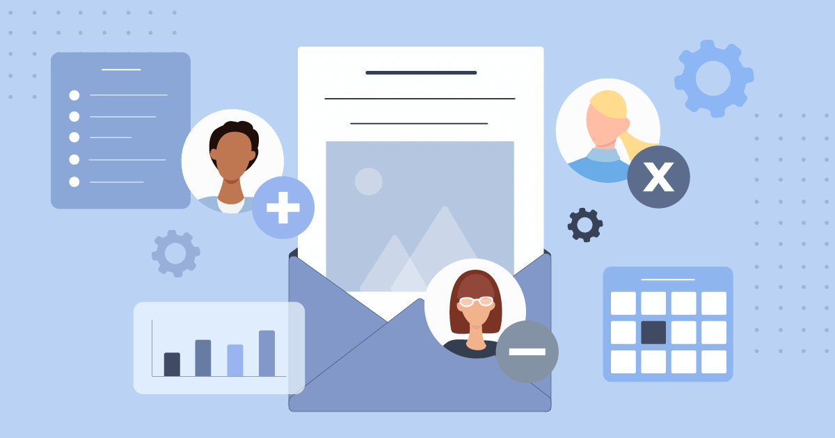
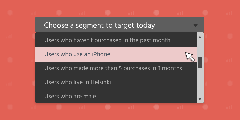
In brief, it’s an email marketing technique aiming to divide your subscriber lists into different segments based on shared characteristics. For example, these could be their demographics, such as age or education level, or data like geographic location or purchase history.
The end goal is to deliver more personalized email campaigns to your customers and prospects. Most businesses and retailers use email marketing services with segmentation and marketing automation features like Moosend or Mailchimp to streamline this process effortlessly.
Why Is Email Segmentation Important?
So why should a business prioritize segmentation in email marketing? In a nutshell, to receive better campaign results. Let’s see:
Higher Conversion Rate and ROI
According to recent email marketing statistics, segmented email marketing campaigns receive 100.95% higher click rates than non-segmented ones. Meaning that those newsletters are much more likely to convert once they hit your customers’ mailboxes.
Plus, this email marketing tactic is linked with a 760% increase in email revenue. As you can understand, sending newsletters in bulk to your email lists is not the best way to communicate with your buyers. Instead, if you deliver the right messages to them at the right time, you’ll see your ROI and other significant metrics growing fast and steadily.
Improved Relationships with Customers
How would you think of a brand that constantly sends you newsletters with irrelevant content? We bet you’d be tempted to hit the unsubscribe button and wave them goodbye. Well, targeted emails are here to save the day.
When customers receive emails with meaningful and relevant content, they gain more trust in your brand and become more eager to choose it again and again. So email segmentation can elevate your relationship marketing efforts, too.
Better Email Deliverability
As implied in the previous section, when your subscribers are not happy with your mailing habits, they’re very likely to move your emails campaigns to the spam folder. But if this happens regularly, it will gradually hurt your sender’s reputation.
Email marketing segmentation can help you tackle this challenge, too. If the readers can relate to the email content, they’ll pay more attention and keep it safe. Plus, your email marketing efforts will continue to grow by utilizing an email service provider with a high deliverability rate like Moosend that hits a 98% deliverability score.
What Are The Four Types Of Customer Segmentation?
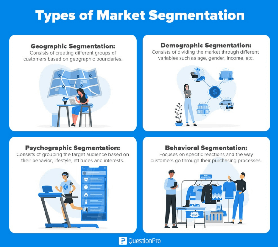
There are four main segmenting groups to consider in email marketing. Let’s have a look:
Demographic Segmentation
Demographic segmentation means dividing your current and new customers into different segments based on demographics such as age, family status, or income to deliver more personalized experiences to them.
But which demographics should you prioritize? It depends on the product/services your offer. For example, if you’re selling baby products, age and family status can be essential for you. Targeting these products to individuals under 20 or above 50 won’t have the same impact.
Geographic Segmentation
If you want to target consumers that shop and live in certain countries or locations, you can segment your lists based on geographic data. For example, if you’ve launched a new brick-and-mortar shop in a specific city, it’s best to ping subscribers around that area.
Moreover, if you send emails to customers at different time zones, adapt your campaigns accordingly to maximize your open rates. Would you take into account an email delivered to you by a brand at 11 pm? Probably not! So make sure to schedule your newsletters based on these criteria to avoid confusion.
Behavioral Segmentation
Consumer behavior is a rather complex concept. Every buyer is unique, but there are specific consuming pathways to follow, such as the purchase history or website activity, that usually lead to more safe conclusions about your customers’ interests.
This information will let you plan up-sells and cross-sells and make relevant product recommendations to your customers. In short, behavioral data will help you build stronger relationships with your customers, leading to conversions.
Psychographic Segmentation
Last but not least, you can also segment your lists based on psychographic data to boost email engagement. These include your buyers’ attitudes, behaviors, beliefs, values, interests, and opinions, which when considered can pivot the success of your email marketing strategy.
Later on, we’ll discuss how to collect that data to kick off your strategy. But first, we’ll dive more into some email segmentation examples to inspire you!
20 Email Segmentation Ideas For Beginners With Examples
We’ve divided this list into three different sections: generic, B2B, and B2C. Let’s explore them:
Generic Segmentation Criteria
These criteria can apply to every business based on the product/service they offer.
1. Location
Ιf your business operates in different locations, regions, or countries, it’s important to segment your email lists accordingly. This is even more crucial when working in different timezones to avoid reducing your open rates.
For example, if you have a SaaS eCommerce business with an international presence, sending messages in bulk might confuse your readers in certain countries and harm your reputation.
Moreover, Moosend’s weather-based recommendations can also fit into this bucket list. Show your customers that you know exactly what’s in it for them based on the exact place they live.
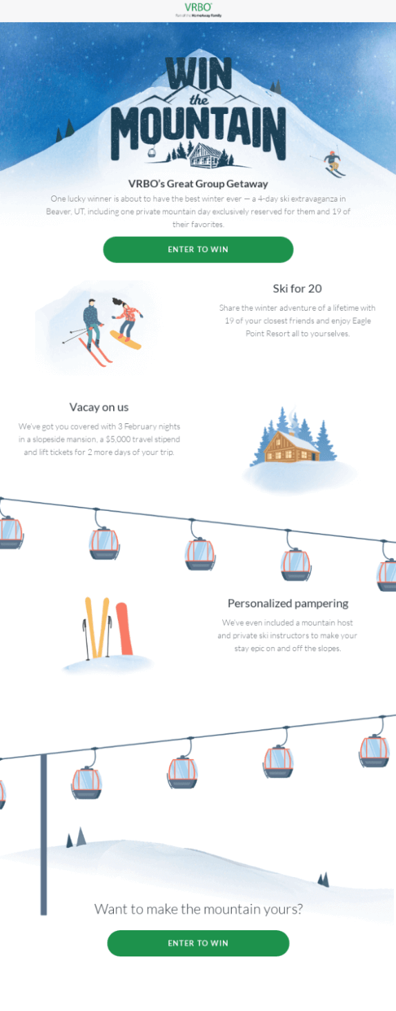
If you want to see a compelling example of how to use the weather theme in your newsletter, look at this campaign by VRBO:
Subject Line: win the winter
2. Engagement Level
Splitting your subscriber base into active vs. inactive users based on open and click-through rates is another great way to segment your customers. You can alter your messaging accordingly to increase conversions.
For example, with inactive users, you can send re-engagement emails to grab their attention from scratch and even re-introduce yourself as a brand if possible. Dare to combine additional data to unveil their true interests.
As for active users, make sure to track that data, too. Learning the patterns that work is substantial to keep the engine going. And for the record, Moosend’s tracking capabilities will truly amaze you. Sign up for free today to try our analytics and reporting features and you won’t regret it.
3. Purchase History
Knowing your customers’ purchase history will let you design highly targeted campaigns for them based on their preferences. Remember, relevant and timely emails contribute to the design of an optimal customer experience, increasing conversions down the line.
So if you want to plan successful cross-selling and up-selling activities, this info will help you nail it! Plus, you can also split your audience into different groups based on the average amount they spend on your physical or eCommerce store. Then, you can arrange a special coupon for VIPs to retain their loyalty for eternity.
Here’s a VIP campaign with a fantastic incentive for MVPs of your brand by Baublebar:

4. Funnel Stage
An email marketing funnel includes all the customer journey stages consumers follow, from brand awareness to customer loyalty and advocacy via email. Segment your lists based on the stages of your sales funnel to craft personalized campaigns for the subscribers of each group.
For instance, if a subscriber is on the decision stage, it’d be valuable to share some social proof with them about your products/services. Send an email with your top reviews and maximize your conversion chances. Or, if the average customer journey is shorter, make sure to plan cart abandonment emails to ping them fast.
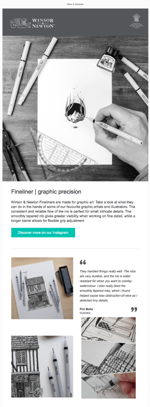
You can also hit two birds with a stone, as this beautiful email by Winsor and Newton does. They included sample work and a review from an illustrator, and a CTA to their IG account to showcase more of the masterpieces made with their Fineliners:
Subject Line: Discover what these illustrators have created with our Fineliners
5. Time Since Last Purchase
Another great segmentation option for your email marketing strategy is to divide your list into frequent buyers and one-time customers. For example, you can promote more upselling and cross-selling opportunities to frequent buyers or prompt them to complete a plan upgrade.
When it comes to one-time buyers, send a lovely welcome email to them straight after their subscription or purchase to warm their hearts. But remember, it’s important to go easy on them at the beginning. Share some of your brand highlights or incentives for customers who haven’t visited your store for a while. It’s up to you to make the final call!
6. Sign-up Source
Which is the first touchpoint of your new subscribers? Is it a lead magnet, like an infographic, or a sign-up form inside your website? Those sources will help you filter out your lists effectively.
For instance, if a subscriber signed up through a webinar for the first time, you can invite them to similar events in the future or send them relevant resources or product recommendations to nurture them further. It’s an opportunity you can’t waste!
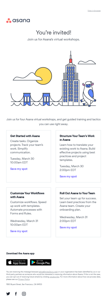
Look at this email by Asana, with all the virtual workshops they offer for subscribers who love webinars:
Subject line: You’re invited to Asana’s virtual workshops
7. Survey Results
Have you ever conducted a customer survey to learn more about your buyers? Apart from demographics, you can also find out about customer preferences, personal interests, and even consumer habits through these amazing tools.
Once you’ve gathered that data, you can use it to nail your email segmentation practices, as they dive more deeply into your buyers’ preferences and attitudes. You can also create a segment with all the survey respondents to thank them for sharing all that valuable information with a follow-up email and give them some extra love in the form of a gift or bonus. Remember, these initiatives always count!
8. Customer Reviews
If you’ve requested feedback from your customers, it’s vital to take it into account and plan your next moves accordingly. Let’s say that you’ve received both exceptional and poor reviews. What should you do to turn even the worst scenario into a plot twist? For starters, let’s see how a customer review email looks like, inspired by Trade Gecko:
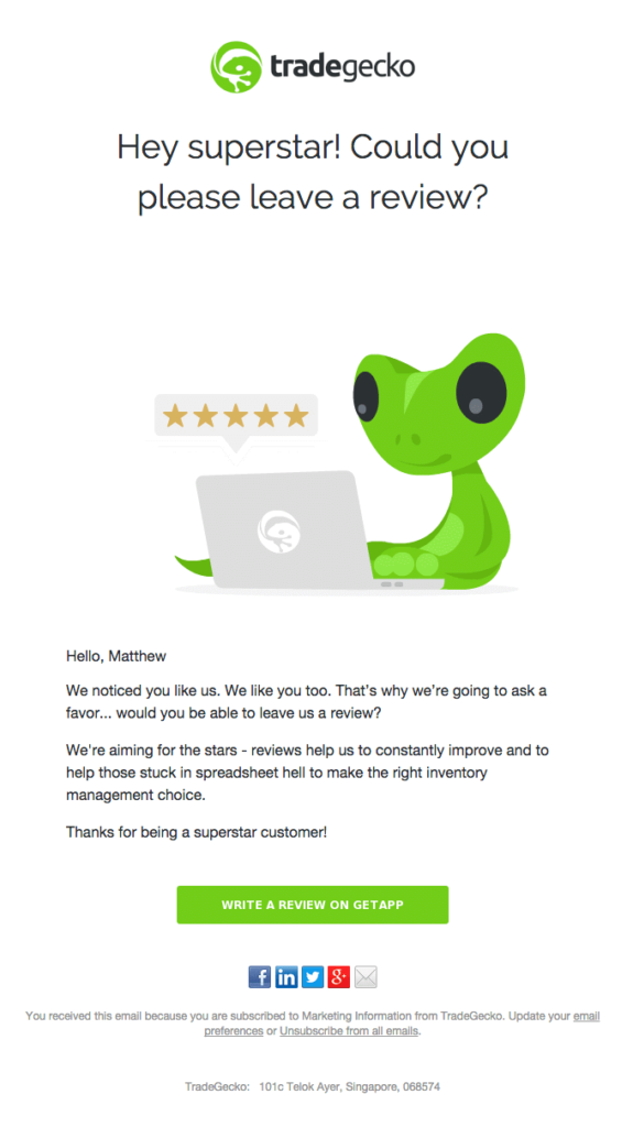
Now, here’s what to do: Create a list with customers that left an exceptional review and run a referral campaign so that more people learn about your brilliant brand. As for bad reviews, take them seriously and try to communicate with those customers to improve your products/services down the line. Finally, don’t hesitate to give them an incentive to win them over again. It’s now or never!
9. Website Activity
As an eCommerce business, your website is one of your greatest assets. Knowing how your customers behave can help you build more personalized campaigns for them at the right time. Here are some segmentation criteria to consider:
- Pages visited
- Pages not visited
- Products they clicked
- Relevant content they’ve missed
Tools like Hotjar will enable you to streamline this process more efficiently. Overall, combining the forces of different channels to plan your outreach, such as your website, social media, and content marketing can work wonders.
10. Device
Did you know that 48% of emails are opened on mobile devices? This means that almost half of your customers might do the same. And user experience for mobile users is slightly different compared to desktop handlers.
To design an optimal experience for both, you can create different list groups to secure responsive email design for mobile devices. For example, you can include a shorter subject line, less copy, and a single layout.
B2C Segmentation Criteria
Now, let’s see some of the best email segmentation criteria for stores that operate in the B2C eCommerce scene:
11. Income level
A customer’s income level says a lot about their lifestyle and interests in most cases. Knowing this information is even more important for businesses selling luxury products/services with a specific buyer persona in mind.
Apart from the income, which can be a bit tricky to ask at times, you can also create different groups based on education level or employment. Of course, this depends on the products/services you own.
12. Family Status
When should a person’s family status get on your segmentation priority list? One outstanding case is when you serve different target groups and one of them is parents.
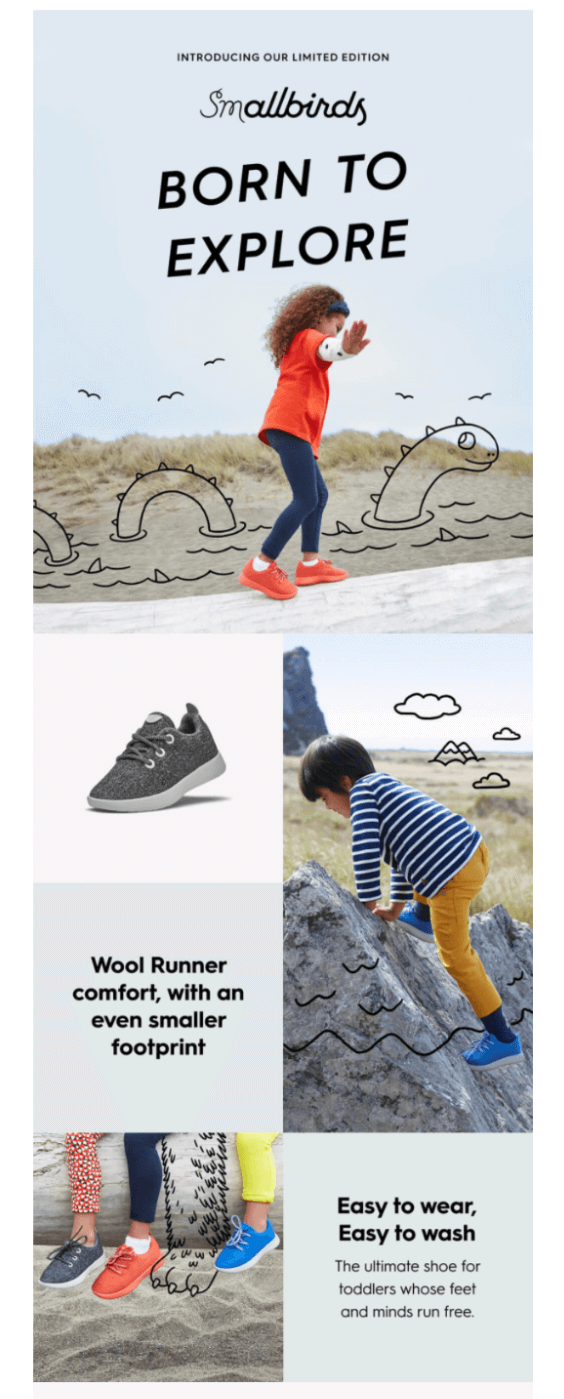
When you specialize in products for children, your messaging should be slightly altered to a more warm and empathetic tone. Look at this campaign by Allbirds:
Subject Line: Our Allbirds Family Is Growing
13. Brick-And-Mortar vs. E-Customers
If you own a physical and an eCommerce store, it’s best to place customers that only visit your shop on a separate list. This way, you can inform them about the latest news of your brick-and-mortar products and deals.
On the other hand, for online-only customers, you can save the news of your e-shop, while you can always invite them to say hello in person!
14. Gender
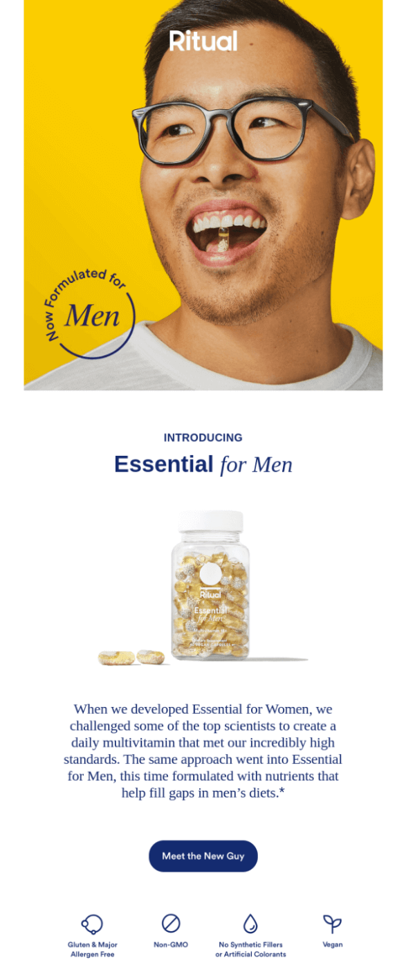
If you offer products/services both for women and men, create different segments to send more targeted messages and convert faster. Remember to tailor your content to your target audience each time.
Have a look at this campaign by Ritual, which is well suited for men:
15. Age
Another common demographic to consider is the age of your audience. Divide your list into different age groups and make product recommendations or share deals that matter to your subscribers based on the life stage they’re in.
B2B Segmentation Criteria
But what happens if your customers are not individuals but businesses? Here you go:
16. Company Size
If you offer services to businesses of different sizes, you’d better split them into separate segments. Here is a common categorization to consider, based on the headcount of each organization:
- Micro: 9 people or less
- Small: 10 to 49 employees
- Μedium-sized enterprises: 50 to 249 employees
- Large enterprises: More than 250 employees
17. Revenue
Or, you can divide your customers into segments based on their estimated revenue. Knowing this information will enable you to promote the right products to the right customers. For example, if you own a SaaS business, you can promote more of your custom plans to enterprises with higher revenue.
If you want to clear the air about your customers’ revenue, utilize a tool like Clearbit – it will make a huge difference.
18. Job Title
Another way to personalize your emails is to divide your lists based on the recipient’s job title. Let’s say that you offer an applicant tracking system. Recruiters, hiring managers, and HR professionals should be on your list. For example, let’s have a look at this newsletter by Workable, offering great resources for the HR world:
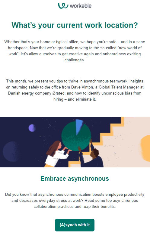
And if you wish to attract C-Suite level employees, make sure to keep a professional tone and add the name of a manager or executive on the sender’s name to draw their attention.
19. Industry
If you target your products to businesses from different industries, you can also categorize your lists based on that data. Not all your products relate to every customer.
To see your emails convert, adapt the type of emails and messages based on the exact industry or business type. For example, in manufacturing, the tone is more official and technocratic compared with organizations in creative industries.
20. Partners
Of course, you can’t leave your partners out of your segmentation game. Build separate lists of them based on the nature of your collaboration.
For instance, you may want to send common updates to your 5-star partners or freebies, such as a free pass to webinars or access to your services for a certain period.
Tips For A Successful Email Segmentation Strategy
Are you convinced that email segmentation can play a vital role in the success of your digital marketing strategy? If yes, here are some tips to get started:
Collect Customer Data
How can you start gathering valuable data to segment your lists down the line? There are four main ways to achieve this:
Sign-up Forms
First off, you can ask for basic demographics at the subscription forms that appear on your website. Many formats can steal the show, such as floating bars or inline forms, and hopefully entice visitors to subscribe.
However, avoid going deep into detail as it’s too early for users to trust you. If you treat things properly down the road, you’ll yield the data you wish for, such as age, education level, etc., later on.
And of course, when a new customer completes a purchase for the first time or signs up for a demo, share an online contact form asking everything you need. Once they give you their consent to send them emails, you can use that data to filter out your lists.
Lead Magnets
A lead magnet is a free marketing resource you share with your prospects to gather their basic information, add them to your pipeline, and convert them into customers when the right time arrives. This is a lead magnet by Hubspot, in the form of a free guide:
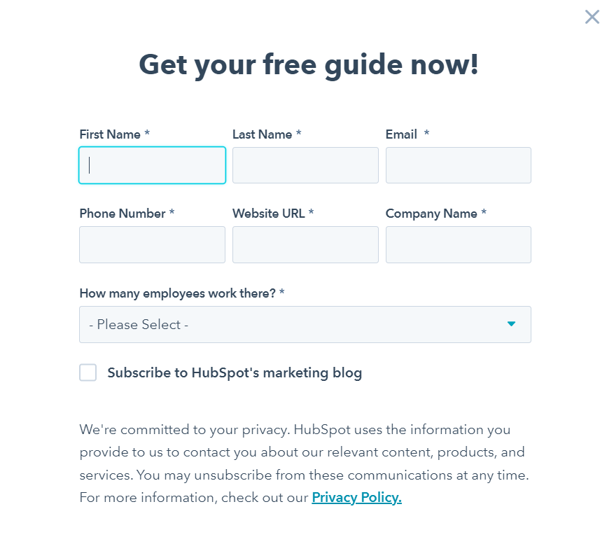
You can also use these items to collect information about consumers interacting with your brand and boost your segmentation efforts.
Customer Surveys
And of course, you can use the powerful tool of customer surveys to learn more about your buyers and prospects for segmentation purposes.
Keep in mind that the format of the survey is what makes it successful. Combine open-ended with close-ended questions and share an incentive with them to get as many responses as you can.
Analytics
Last but not least, resort to your analytics tools such as Hotjar and Google Analytics to get a better understanding of your customer’s activity and behavior. Map their journey and use it to give them the best personalized experience possible!
Get An Email List Segmentation Tool
Most email marketing platforms provide their customers with segmentation features and at the same time enable them to build automated workflows and take personalization to the next level.
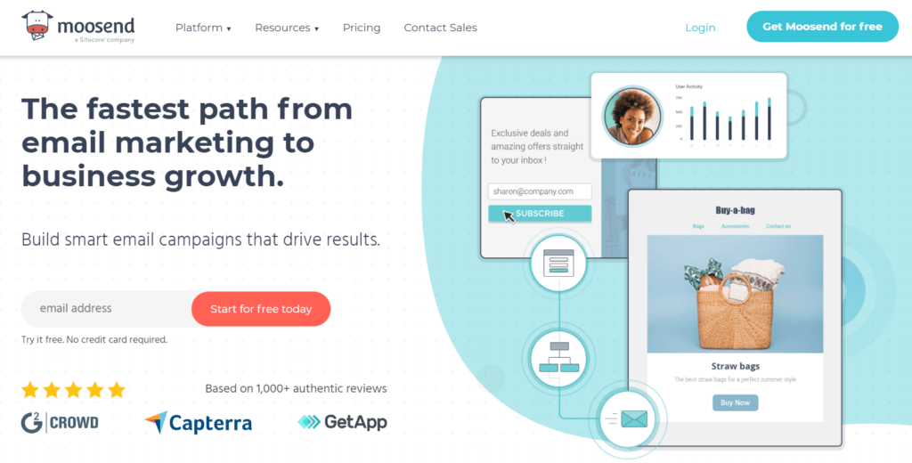
With Moosend segmentation becomes a piece of cake. With the use of Custom Fields and behavioral data, you can filter your lists to craft personalized content for your target audience.
Plus, you can integrate it with email list cleaning services to keep your lists up-to-date and avoid harming your sender’s reputation.
Apart from that, Moosend is an email automation platform with various ready-made templates and features to design great campaigns fast. Sign up today and see it for yourself!
Track, Improve, And Repeat
As with every other business process, email segmentation is prone to succeed and fail at times. To grasp which patterns are effective, use a platform to monitor your top metrics such as your open and click-through rates, or spam reports and bounces.
Moosend’s reporting and analytics are top-tier in this territory, too. Monitor your metrics in real-time and see how to improve your performance in the future.
Email Segmentation Makes For Maximal Personalization!
There’s no doubt that segmentation can work miracles for your email marketing strategy and bring customers and prospects to your threshold ready to convert. So start segmenting your lists today based on your chosen criteria and see your business thrive.
And if you’re looking for an all-in-one email marketing solution, with excellent segmentation, automation, and reporting capabilities, Moosend should be your final call. Start your free trial today and see it for yourself!

 Published by
 Published by
